
library(knitr)
library(scales)
library(tidyverse)Panel plots are a common name for figures showing every person’s (or whatever your sampling unit is) data in their own panel. This plot is sometimes also known as “small multiples”, although that more commonly refers to plots that illustrate interactions. Here, I’ll illustrate how to add information to a panel plot by arranging the panels according to some meaningful value.
Here’s an example of a panel plot, using the sleepstudy data set from the lme4 package.
data(sleepstudy, package = "lme4")
ggplot(sleepstudy, aes(x = Days, y = Reaction)) +
  geom_point() +
  scale_x_continuous(breaks = 0:9) +
  facet_wrap("Subject", labeller = label_both)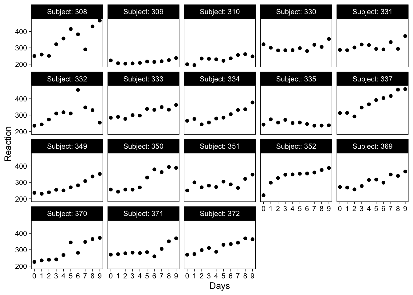
On the x-axis is days of sleep deprivation, and y-axis is an aggregate measure of reaction time across a number of cognitive tasks. Reaction time increases as a function of sleep deprivation. But the order of the panels is entirely uninformative, they are simply arranged in increasing order of subject ID number, from top left to bottom right. Subject ID numbers are rarely informative, and we would therefore like to order the panels according to some other fact about the individual participants.
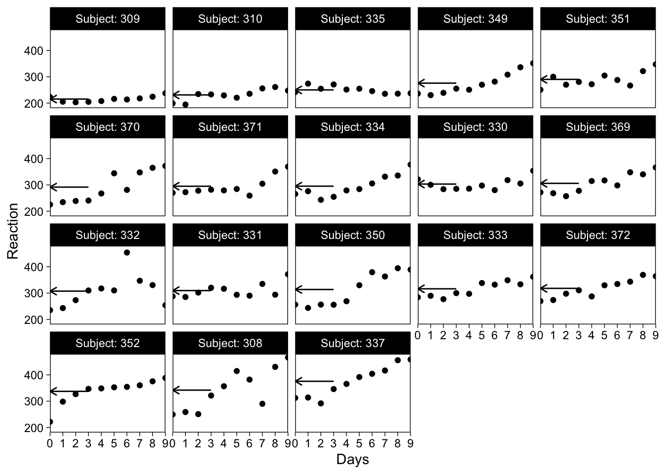
Order panels on mean value
Let’s start by ordering the panels on the participants’ mean reaction time, with the fastest participant in the upper-left panel.
Step 1 is to add the required information to the data frame used in plotting. For a simple mean, we can actually use a shortcut in step 2, so this isn’t required.
Step 2: Convert the variable used to separate the panels into a factor, and order it based on the mean reaction time.
The key here is to use the reorder() function. You’ll first enter the variable that contains the groupings (i.e. the subject ID numbers), and then values that will be used to order the grouping variables. Finally, here you can use a shortcut to base the ordering on a function of the values, such as the mean, by entering it as the third argument.
sleepstudy <- mutate(
  sleepstudy,
  Subject = reorder(Subject, Reaction, mean)
)
Now if we use Subject to create the subplots, they will be ordered on the mean reaction time. I’ll make the illustration clear by also drawing the person-means with small arrows.
Order panels on other parameters
It might also be useful to order the panels based on a value from a model, such as the slope of a linear regression. This is especially useful in making the heterogeneity in the sample easier to see. For this, you’ll need to fit a model, grab the subject-specific slopes, order the paneling factor, and plot. I’ll illustrate with a multilevel regression using lme4.
# Step 1: Add values to order on into the data frame
library(lme4)
mod <- lmer(Reaction ~ Days + (Days | Subject), data = sleepstudy)
# Create a data frame with subject IDs and coefficients
coefs <- coef(mod)$Subject %>%
  rownames_to_column("Subject")
names(coefs) <- c("Subject", "Intercept", "Slope")
# Join to main data frame by Subject ID
sleepstudy <- left_join(sleepstudy, coefs, by = "Subject")

# Step 2: Reorder the grouping factor
sleepstudy <- mutate(
  sleepstudy,
  Subject = reorder(Subject, Slope)
)
Then, I’ll plot the data also showing the fitted lines from the multilevel model:

Hopefully you’ll find this helpful.
Reuse
Citation
BibTeX citation:
@online{vuorre2016,
  author = {Vuorre, Matti},
  title = {How to Arrange Ggplot2 Panel Plots},
  date = {2016-12-06},
  url = {https://vuorre.com/posts/2016-12-06-order-ggplot-panel-plots},
  langid = {en}
}
For attribution, please cite this work as:
Vuorre, Matti. 2016. “How to Arrange Ggplot2 Panel Plots.”
December 6, 2016. https://vuorre.com/posts/2016-12-06-order-ggplot-panel-plots.